Introducing: Consider’s new look


We’ve been growing.
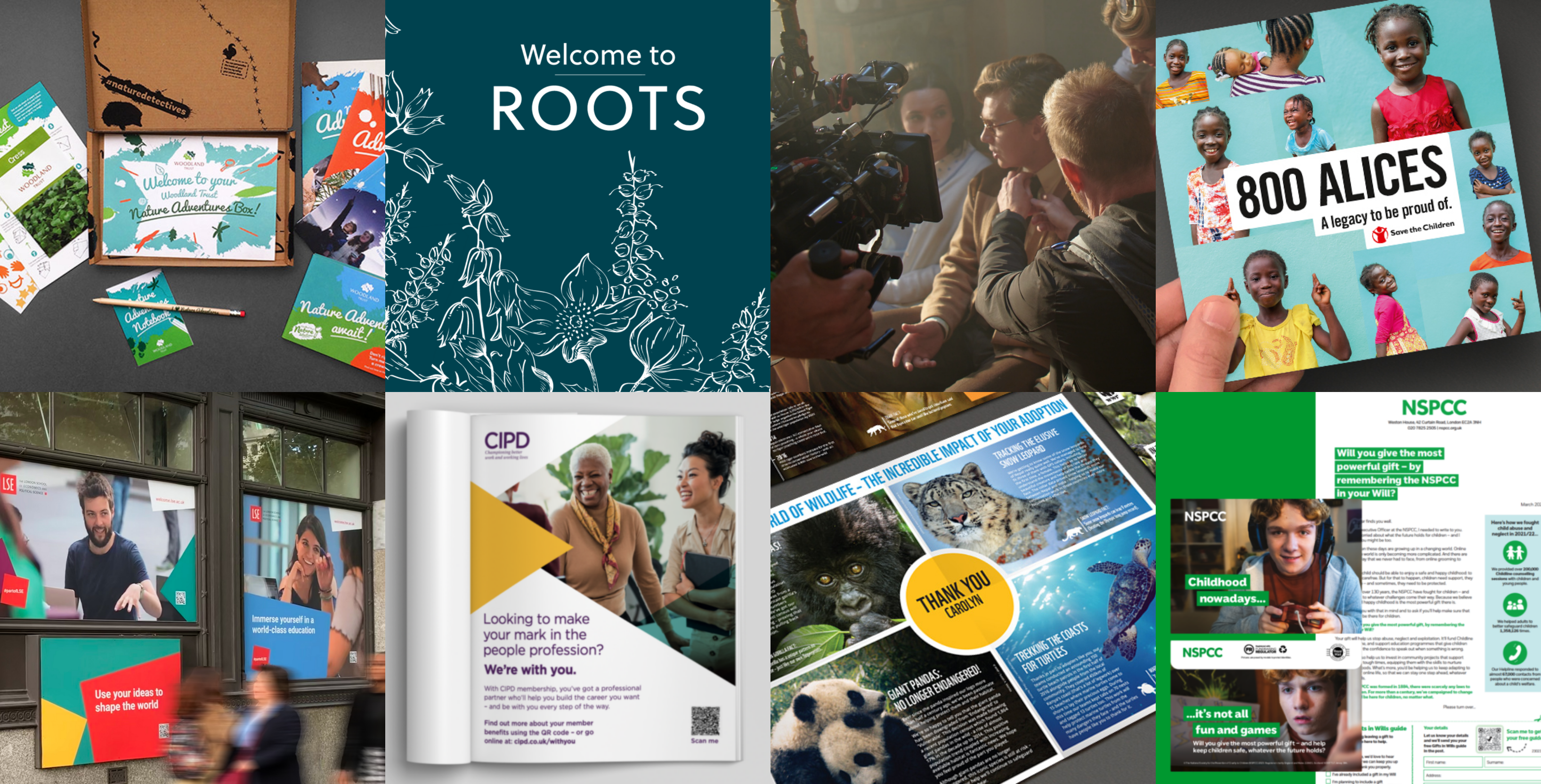
In fact, the past three years have been the biggest leap forward in our twenty-year history. With our strategy, creative and client teams stronger than ever, we’re producing work that’s genuinely transforming our sectors.
We needed a brand identity to match.
Ever since the beginning, our story has been about possibilities. About asking – what if?
What if, through new ideas, fresh stories and compelling campaigns, we could energise the organisations fighting to make the world a better place? Help them reach new audiences, inspire the next generation of minds and raise more money than ever before?
When our creative team set about reimagining our brand, that’s where they started.
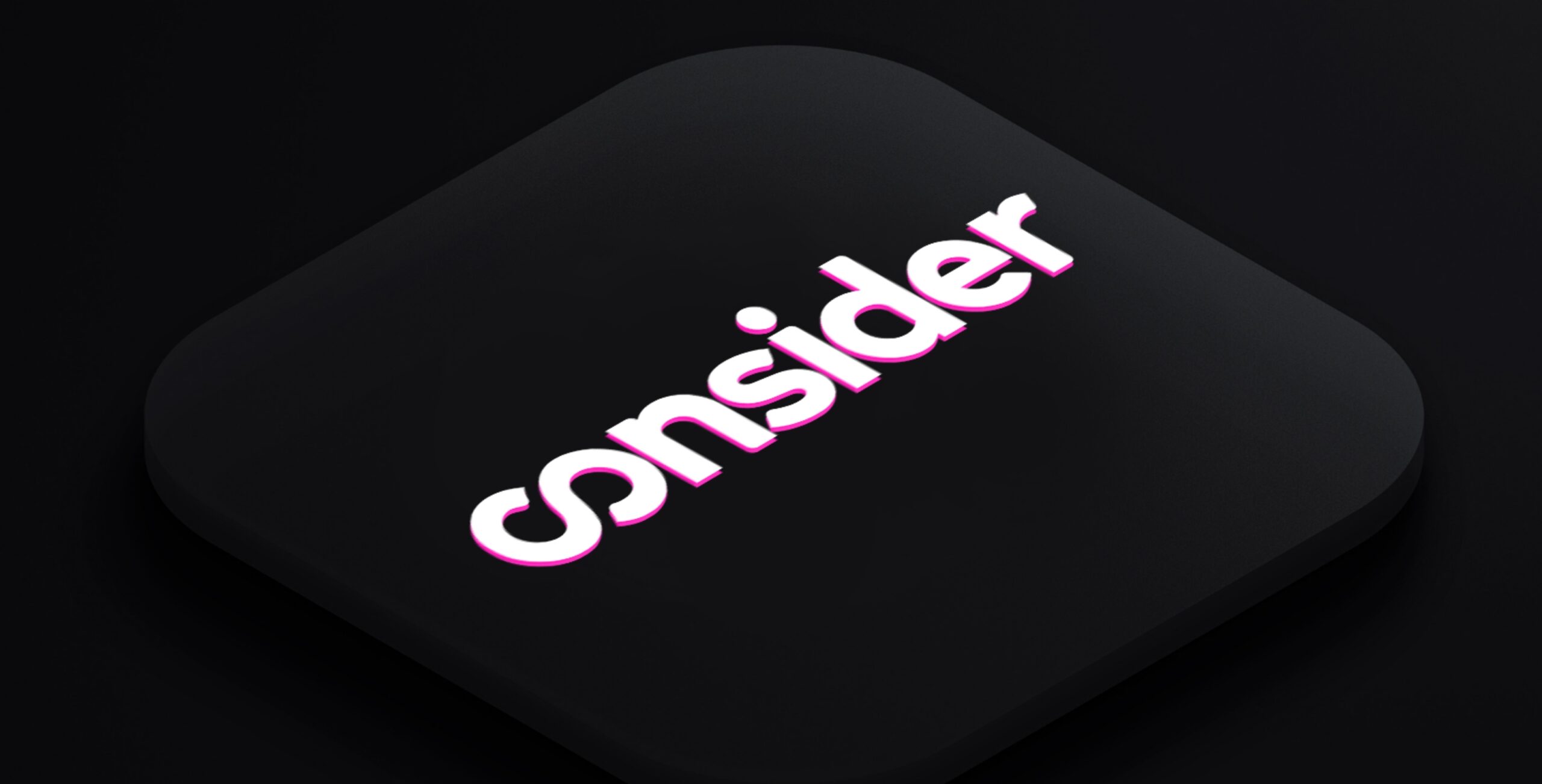
And after a careful process of experimentation, we found our new wordmark and logo – the infinity symbol.
Because exploring new possibilities is where our work begins and ends.
That co- at the start of our name is important, too. Because there’s a second strand to our DNA: partnership.
A shower of words comes to mind. Collaboration. Cooperation. Connection.
All with that Latin root, co-. It means together. That’s how we do it here. Proper partnership – because we know that when our clients can really collaborate with their agency, the most remarkable things happen.
That’s why our signature magenta remains: because that approach was as true in 2003 as it is now. But our vibrant new secondary palette, bursting with colour, nods towards the diversity of work we create with our clients today.
And then there’s our new typeface, which captures Consider’s voice in 2023: no less imaginative, but imbued with the boldness of twenty years of experience. And what a journey it’s been.
Here’s to the next chapter.


